Filter by Topics
WP Google Map plugin helps you to embed Google Maps in your responsive website so the maps resize automatically based on the screen size of the visitor’s browser.
Responsive Google Maps
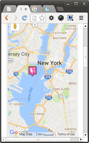
If you resize the browser or view the page on a small device, the embedded map would adjust its size automatically based on your screen size.
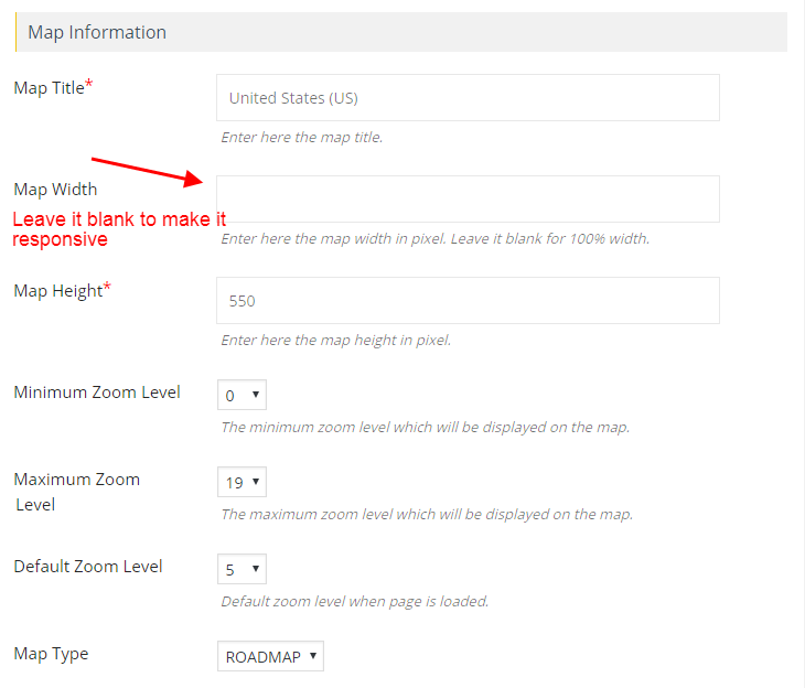
Step 1 Go to Add or Edit Map and leave the Map width column blank to make the map responsive.

Step 2 click Save map and open it in browser.
Your map now will be responsive. Try resizing your browser to see it in action.

Non Responsive Google Maps
Step 3 To make the map non responsive enter any Map width.
Your map now will be non-responsive. Try resizing your browser to see it in action.

