Website optimization for the needs and habits of customers is no more a discovery. Developers and designers put a priority on the convenience for visitors because it’s the only way to make them come back again and again. It’s clear with site pages, but what about maps? Can they be more user-friendly? We have some ideas about what to do to improve Google Maps UX. Read them below.
Customize infowindows
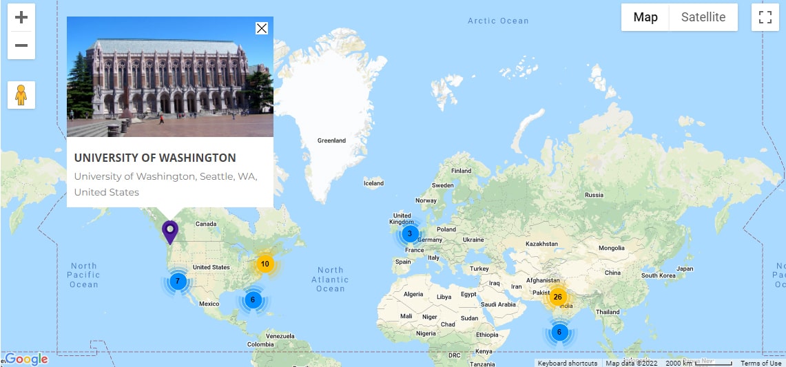
Infowindows are squares with information about locations that appear when you click on their markers. The content can be different: from a description in a sentence to a detailed explanation with address, phone number, email, link, etc. So, add the items that will be useful for your customers and outline them as separate fields for better perception. You can also set the color and width of infowindows. Upload a picture of the object to put a finishing touch to improving Google Maps UX. Read more about this option here.
Optimize for different screen sizes
It is a far cry from the days when people used only PCs to surf the Internet. Today more and more people are using smartphones, especially for shopping. This is why the mobile version is so important for the UX. Since maps are usually interactive, it should be convenient for people to navigate, scroll and zoom. This example will help you to find out how you can optimize them for different screen sizes.
Set marker clusters
If you have too many locations on the map, they can overlap each other or cover the surface. To improve Google Maps UX, you can apply marker clusters. The idea is that markers will be grouped when you zoom out and separated when you zoom in. Check how it works here.
Make listings paginated
WP Map Pro plugin provides an option to display listings of posts and locations below the map. It’s useful when you need to attach large articles or descriptions to certain places. But if there are a lot of them, endless scrolling may irritate people. That’s why we suggest dividing lists into pages for a faster search and navigation. The plugin also has an option to set filters and sort objects by different criteria. Learn more about this feature following the link.
Mark a center location
You can also improve Google Maps UX placing a circle around the place that is the most important for customers. It helps to keep the main location in sight, especially when zooming out. Another advantage is that the highlighted area may show the borders within which you work or provide certain services, e.g. free delivery. You’ll find more information about the option on this page.
Set change of a zoom level and a center point on a mouse click
You have probably seen how this feature improves Google Maps UX on many websites. The idea is that when a visitor clicks on a marker, the map zooms in to a specified scale and becomes centered on it. The benefit is obvious: the system guesses the user’s intention and implements it. It saves some time and helps to navigate better. This is an example of how changing a zoom level works. Following this link, you may see the centering option.
These recommendations will help to make a map on your website more user-friendly and practical. For those who have never dealt with programming, they may seem impossible to realize. The good news is that the WP Map Pro plugin allows adding all these features. Its interface is so clear that work with maps becomes fast and easy. So, take this chance to improve Google Maps UX. Find out more.
